Cuisine Coupon – Photoshop Graphic Design Tutorial 8
In Category:
Intermediate Photoshop Tutorials
Today, we will look into culinary arts, but we are not going to be actually cooking anything. More likely, we’ll be designing a coupon for a Steak House. This Photoshop graphic design tutorial is actually quite simple, and I believe that even a beginner can achieve the beautiful outcome. The purpose in this Photoshop tutorial is mainly to see how you can switch styles of design, and adapt to situations where you have to create something in Photoshop different from what you are rather used to.
…………………………………………………………………………………………………………………………………………………..
Start out by creating a background. You can just save mine, and open it in your Photoshop. That way, you will save time.

Now that we have our background, let’s create the shape for the coupon. Select your Custom Shape Tool, and pick out the postal-stamp-looking shape. If you look at the image to the left, you will find it highlighted. Once you have selected the Shape, draw it out to be approximately the size of mine.

Let’s add some detail to our Shape now. Go to Layer – Layer Style, and apply the following settings. The color used in the gradient is #ffe96d and the color for the stroke is #ffdf4c.


Since our Coupon base is complete, let’s add the ribbon on top for the category/location of the promotion. Once again, go to your Custom Shape Tool, and select the Ribbon which can be seen in the image centered under the ribbon. Oh, and set the background to Default Black.

It’s detail time again. Let’s start with what I call Shine, but can also be taken for as 3D detailing. Duplicate the Ribbon Shape, and set the background to #393939. This might sound a little confusing, but if you follow carefully, you will achieve outstanding results. Grab your Dodge Tool, set the size to 25, Range to Mid tones, and Exposure to 50%. Once you have the settings applied, stroke the left-hand side of the ribbon all the way at the end once, and do the same for the right-hand side. Now, move your attention to the center of the Ribbon, basically imagining as if the tips were never there. Apply the Dodge Tool both to the left-hand side and the right-hand side.
Once you have done that, take out the Burn Tool, and change the Exposure to 100%. Apply the Burn Tool to the left-hand side and the right-hand side of the tips, and do the same for the center of the ribbon, left and right, just as we have done with the Dodge Tool.
And for the last step, set the Opacity of the layer to 50%.


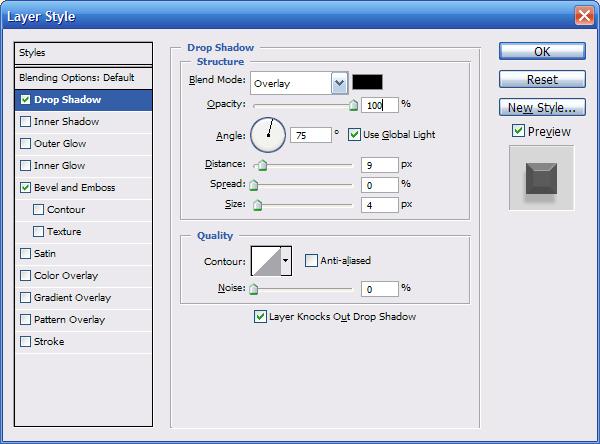
Our Ribbon is almost complete. We just need to add a few touch-ups to make it more 3Dish. Select the Original Shape, not your newly-created overlay, and apply the following settings in Layer – Layer Style.


Results

Now, for our final step. Let’s add our ingredients to the coupon. Apply some dummy text all around the place, and you should be done. After playing around a little, I got the following results:

I hope that you found this tutorial useful, and maybe even a little fun to do.
This Photoshop Tutor tutorial has been tagged with: coupon design, design tutorial, Photoshop design tutorials, photoshop drawing


